Maker Spotlight: Anthony Burrill

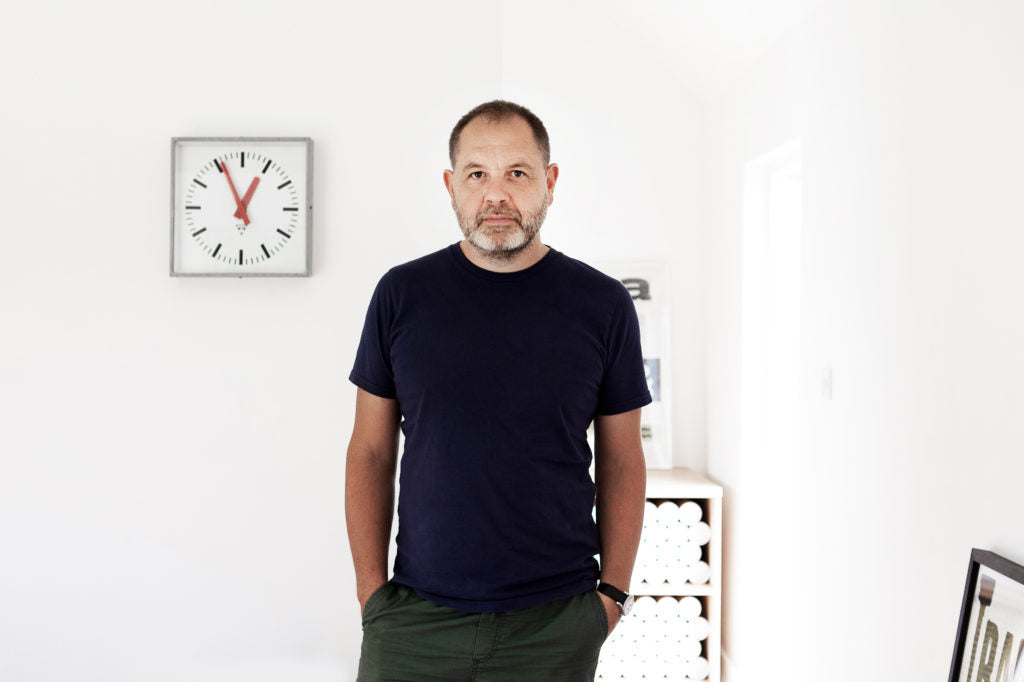
Known in the design world for his persuasive use of language and bold typography, Anthony Burrill is a graphic artist, print-maker and designer living idyllically in the Isle of Oxney, Kent with his wife and two children. A longtime Schoolhouse partner, we've always admired his upbeat attitude and ability to distill wide-reaching concepts and issues down to their most powerful, positive messages for good.
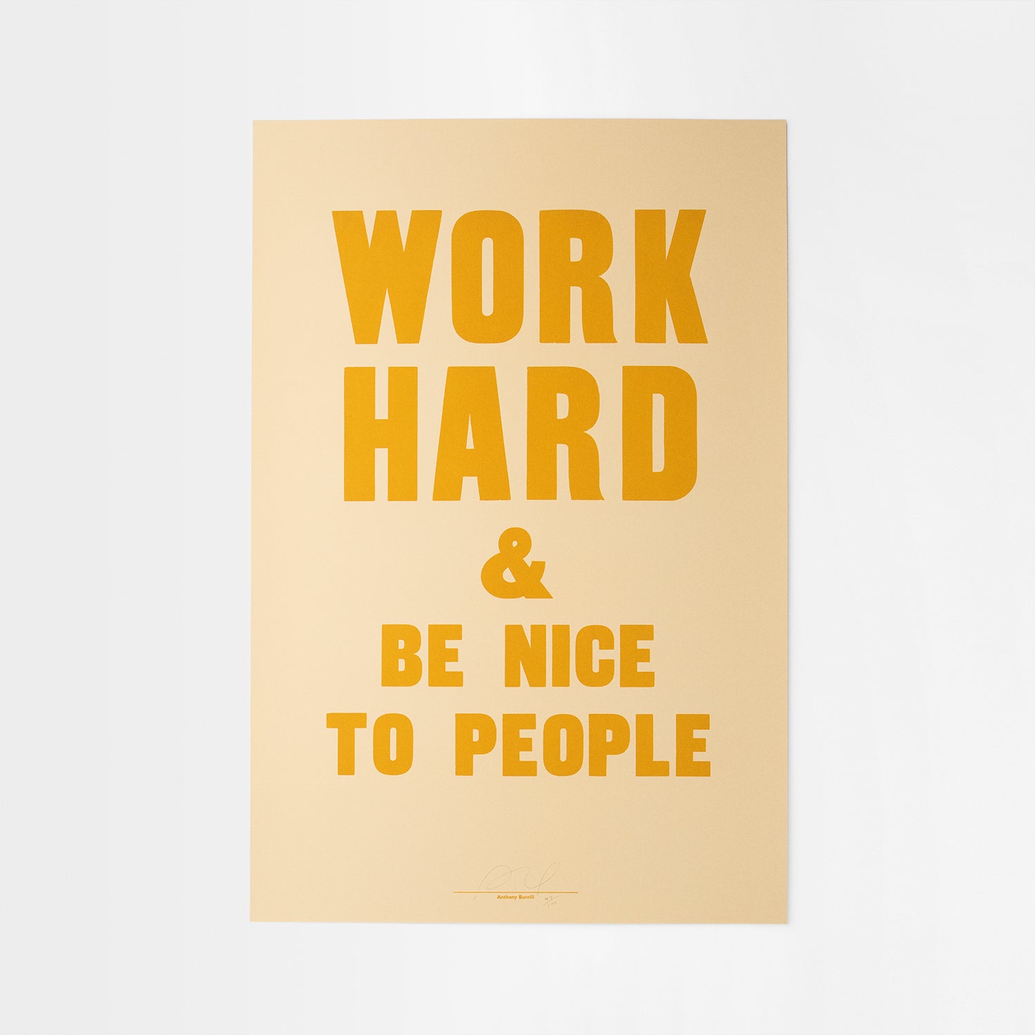
His work is held in the permanent collections at the Victoria and Albert museums in London and has been featured in galleries all across the world. We chatted with him about his work, family, and the inspiration behind his latest Schoolhouse collaboration on the Work Hard Oversized Screenprint.
Describe your life in a 6 word memoir...
"I like it. Do you? (I cheated, I only used five words.)"
What does a typical day look like for you from start to finish?
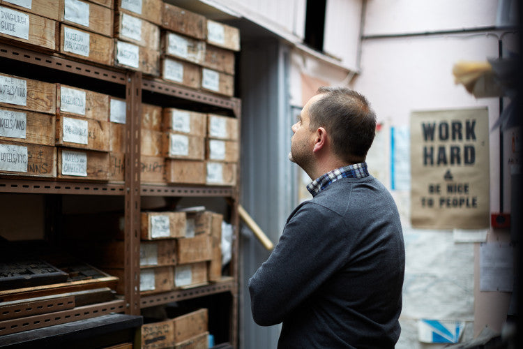
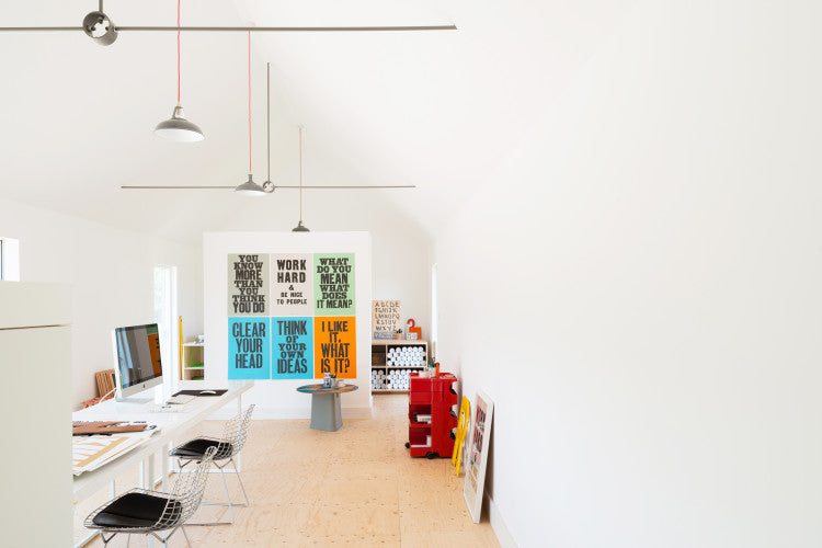
"It depends what I’m working on or where I am. Most days I’m in the studio, working on a mixture of commercial and self-initiated projects. My studio is built next to my house, which is in a small rural village in Kent, it’s very quiet and beautiful. There’s always lots to do in the studio, I enjoy the variety of projects I work on, it’s different every day. I try and use my time effectively so that I’m not working in the studio all the time. I stop work around six and spend the rest of the day with my wife and children."
What about your perfect day?
"Spending time with my family somewhere beautiful."
You grew up traveling the world with your grandfather! Could you share a bit more about how those experiences shaped you creatively?
"I was my grandfather’s traveling companion when I was growing up. After he retired, he was keen to travel the world, and my grandmother was afraid to fly. So, I happily filled the role. Our first trip together was to southern Italy taking in the ancient city of Pompeii and the amazing Amalfi Coast. I was nine years old at the time, and that first trip made a huge impact on me. It filled my imagination and sparked an interest in travel that I still have. On subsequent trips, we traveled to North Africa, Greece, Turkey, Russia, and China. This was back in the early nineteen-eighties when travel wasn’t quite as easy as it is today, and the places we went to felt undiscovered and romantic.
We saw some amazing things together and visited incredible places. I would pick up souvenirs everywhere we went – from bus tickets to maps of archaeological sites - which I would stick into scrapbooks when I got home. I think it’s this obsession with printed ephemera that first sparked my interest in graphic design. Seeing first-hand how visual culture differs around the world, made a huge impact on my young creative brain. Signs from shops and signage in airports fascinated me – the bright colours and unusual typefaces lodged into my brain – and helped shape my visual aesthetic to what it is today."
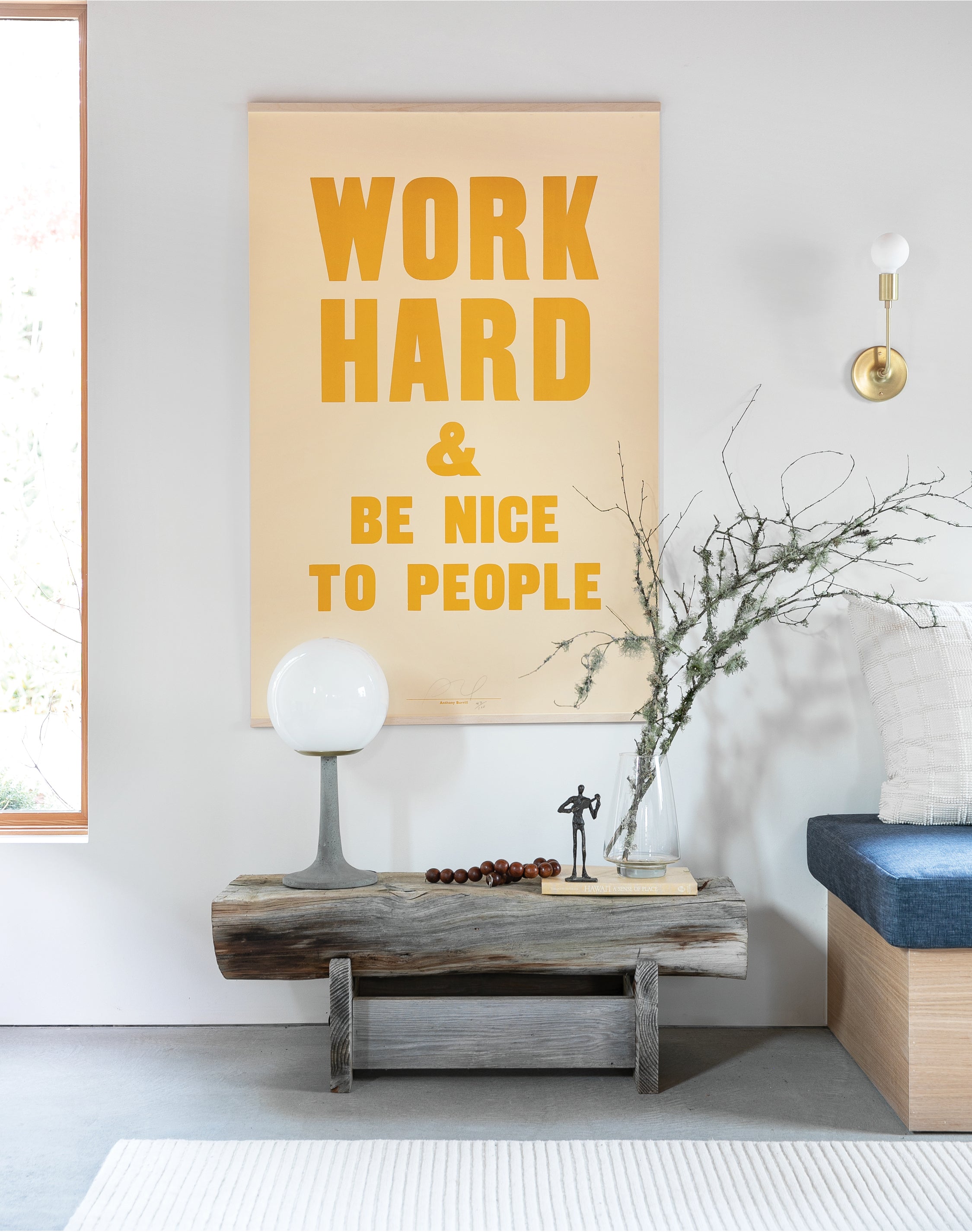
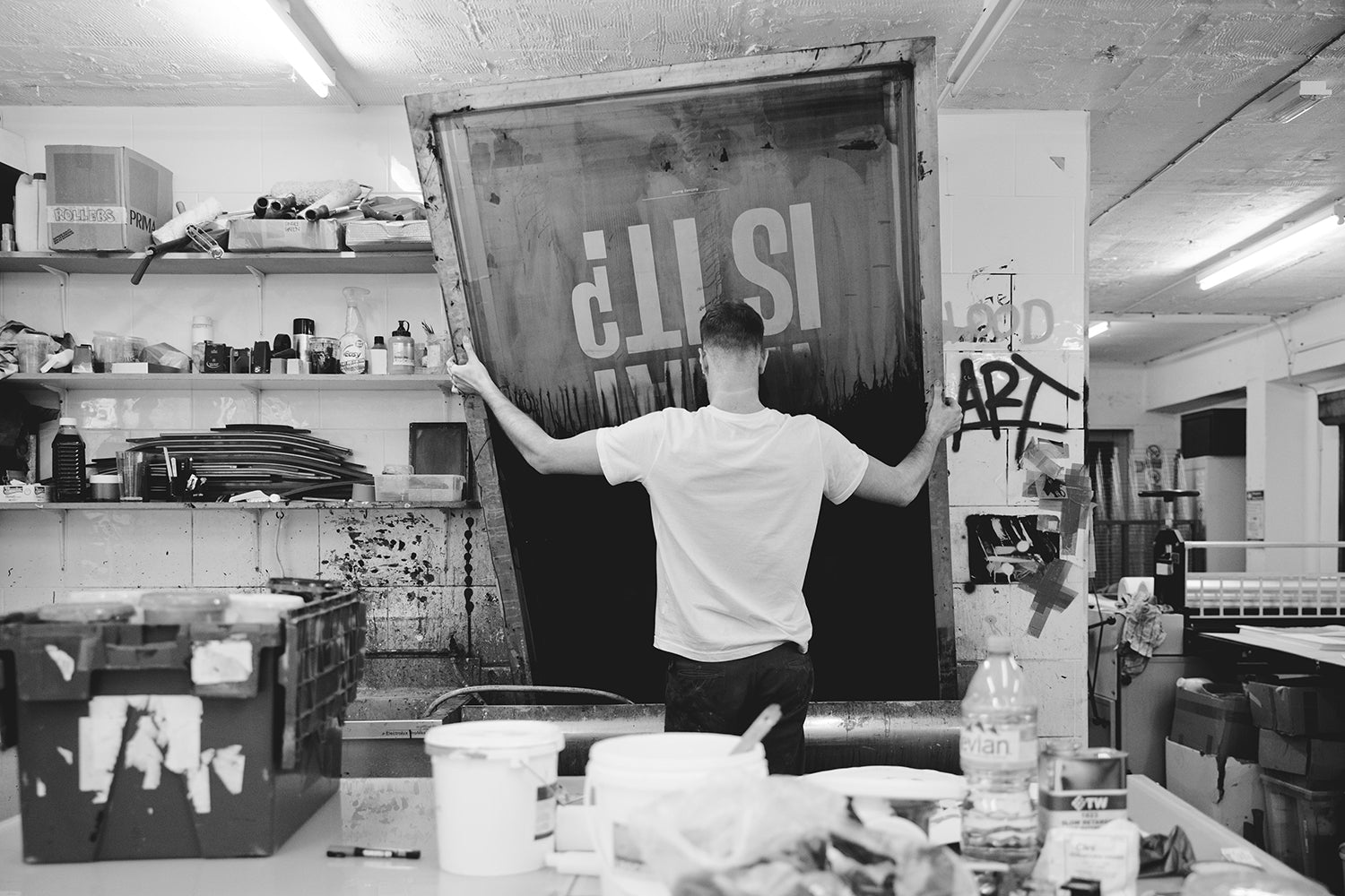
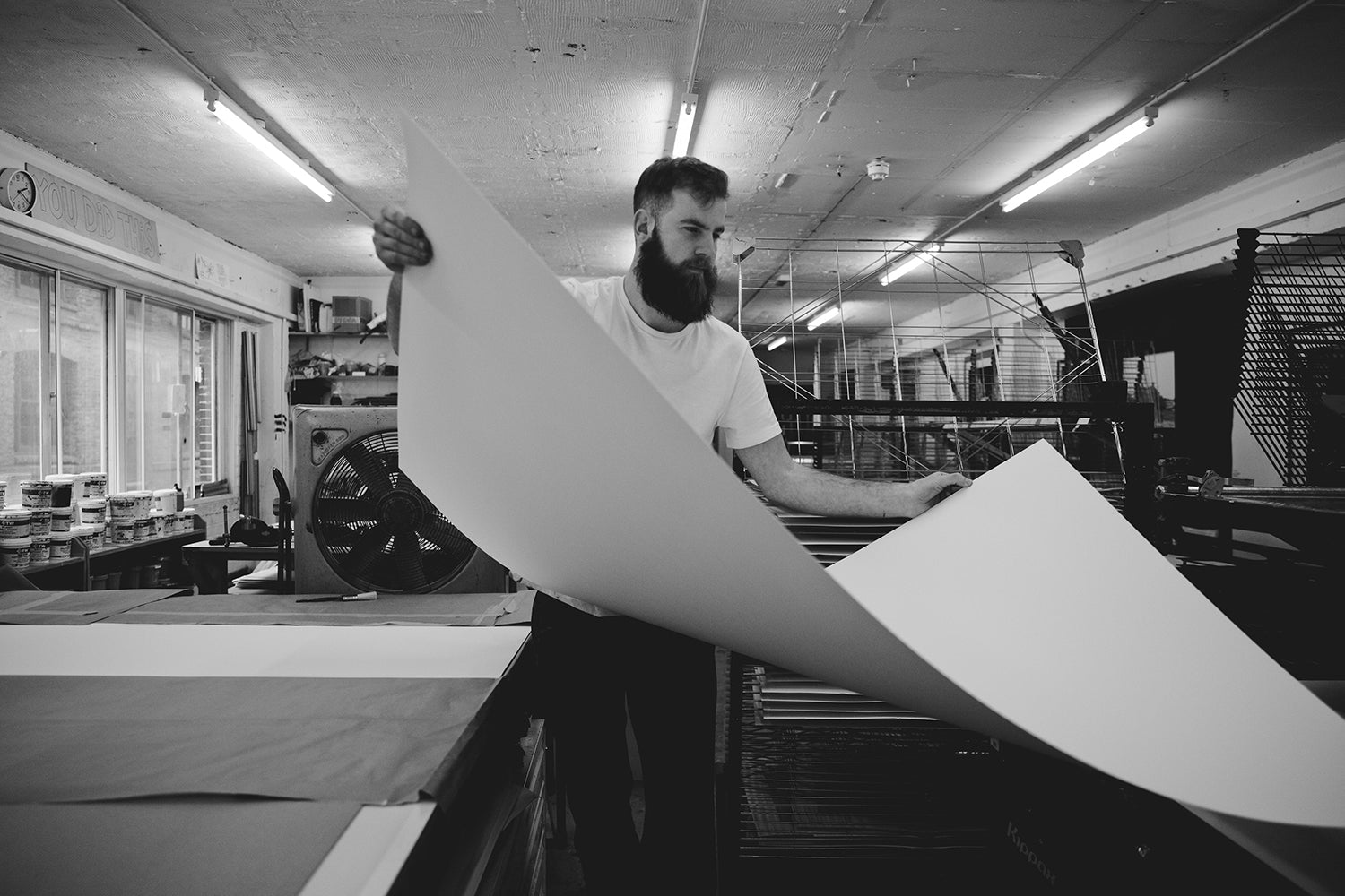
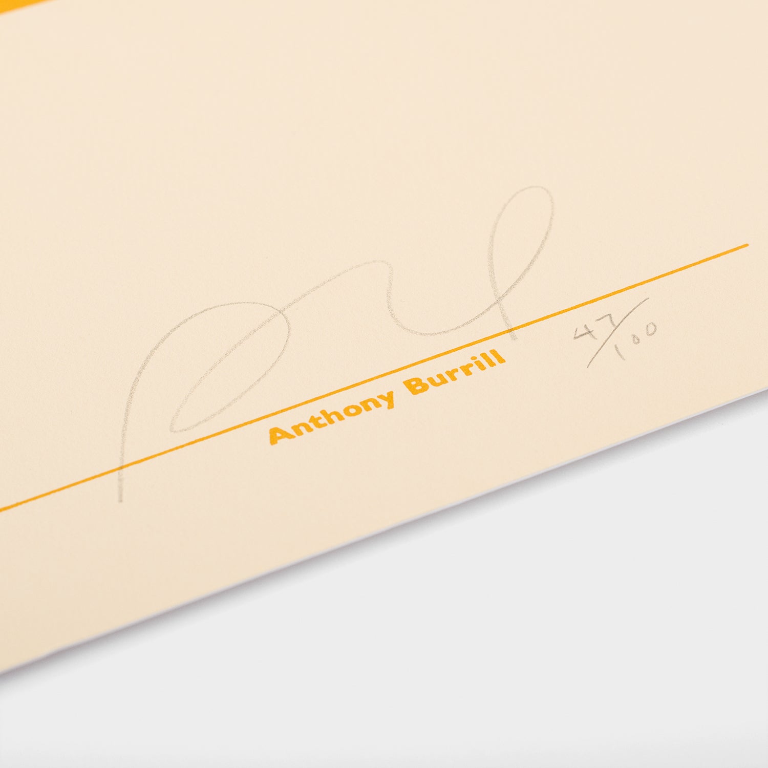
Your latest collaboration with Schoolhouse features an oversized Work Hard Print. Can you share a little bit about the screen-printing process for this particular work?
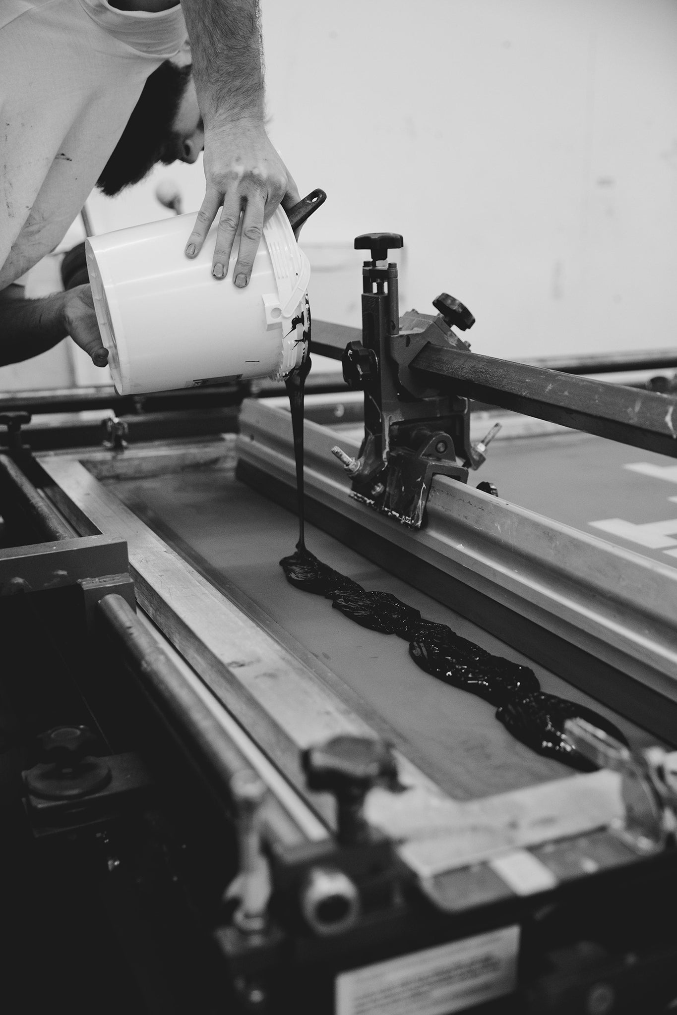
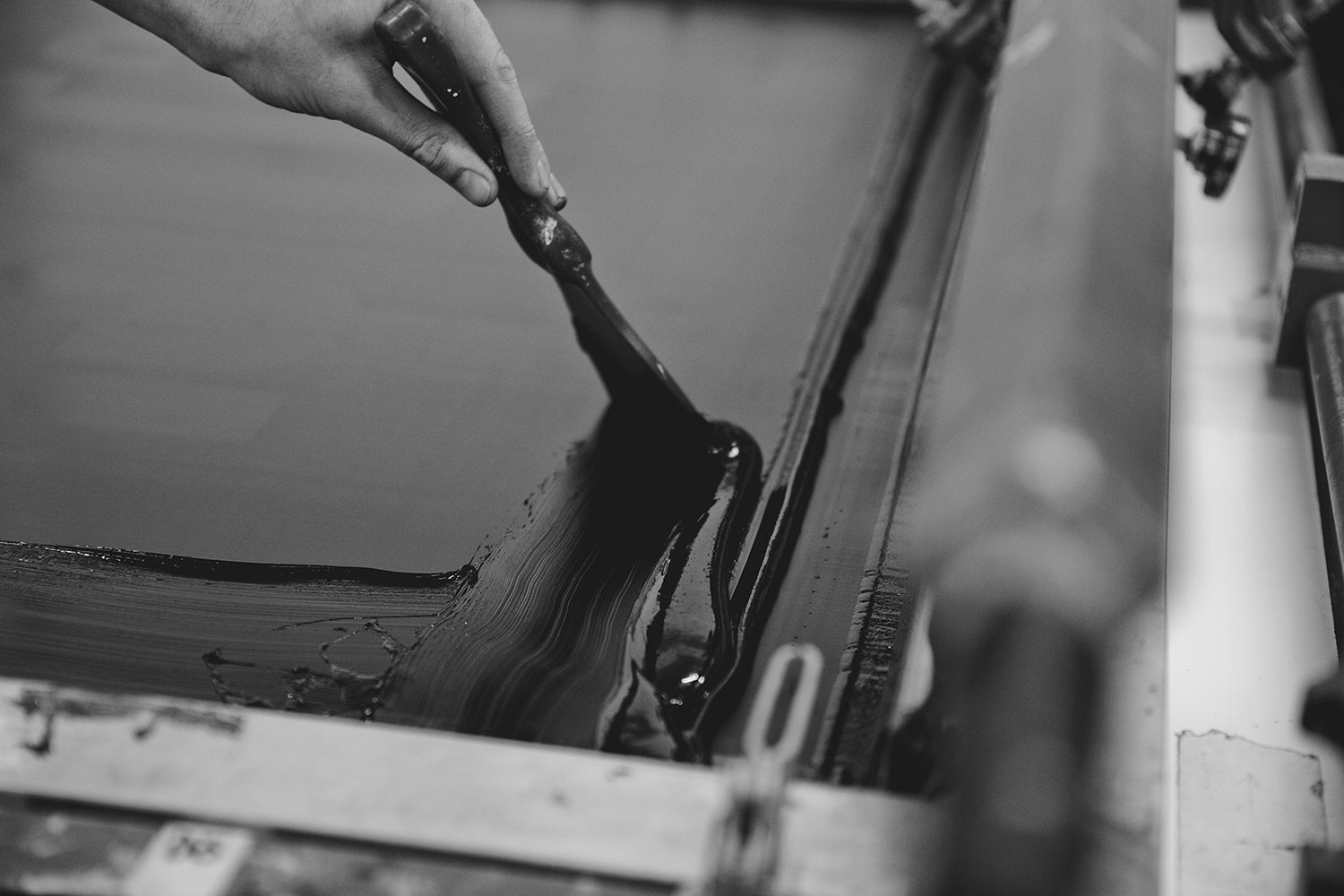
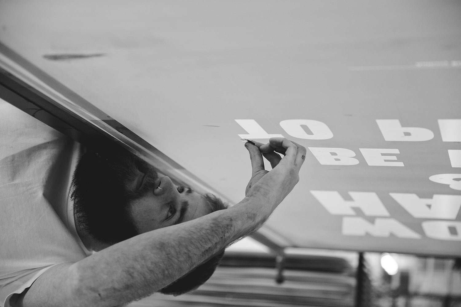
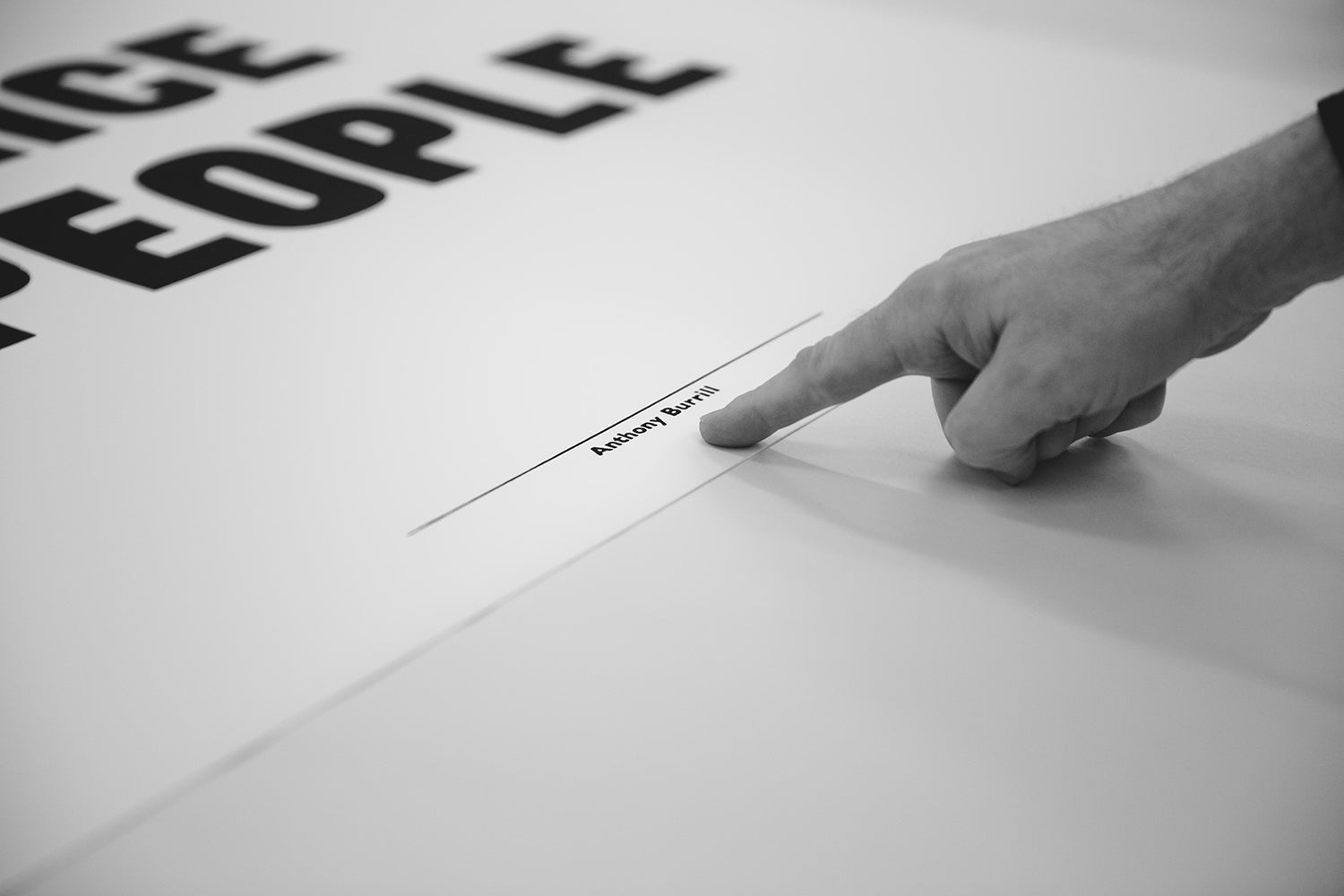
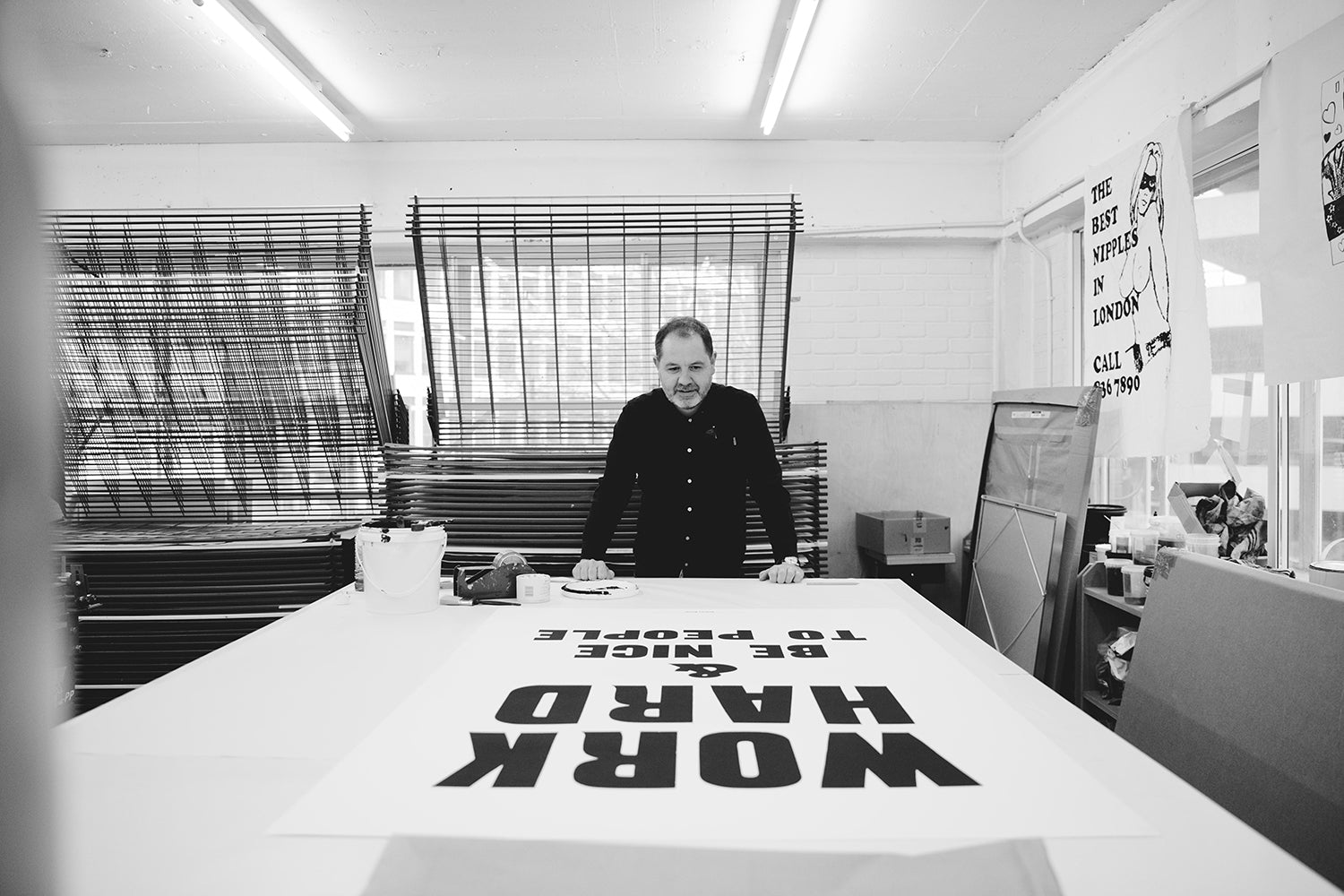
"I chose to use screen print to produce the new edition of ‘Work Hard,’ as it gave me the flexibility of scale. It’s a hand-crafted process that gives a beautiful handmade look and feel to the finished print. We began by transferring the original wood type lettering to the large screen photographically to retain the worn character of the original print. I work closely with Jealous, a screen print studio in Shoreditch, East London, to produce the large prints. I’ve worked with them on previous editions, and it’s always a fun experience. They are amazing printmakers."
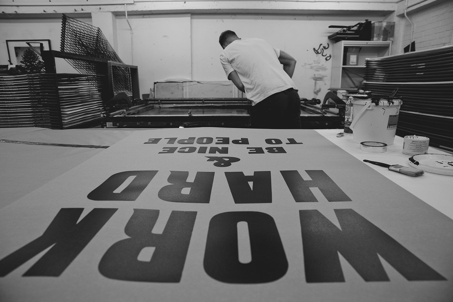
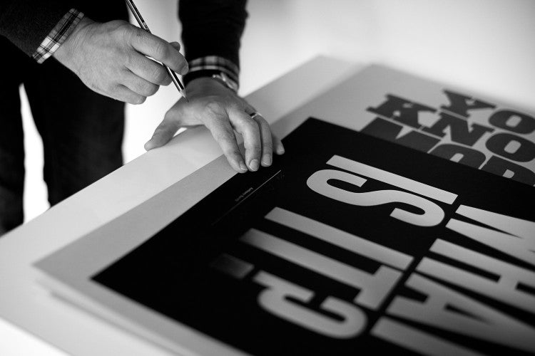
"First, the background colour was printed onto heavyweight paper, this took a day to get everything just right. It’s harder than it looks to print a perfect flat colour. We tested out lots of combinations before deciding on the final colourway for the lettering. Once the background was dry, we over-printed the lettering using a darker tone. It was quite a moment to see how the colours work together on such a large scale. Once the edition was finished, I checked and signed each copy to ensure of consistency and quality."

Your works often have a bold choice of color. How do you go about selecting color for your prints?
"I like to use a simple colour palette most of the time, storing combinations of primary colours that work well together. For this edition, we decided to go slightly subtler with the choices. The prints are very large in scale, and I wanted to make them easy to live with in a domestic setting. The colour combinations feel good for this scale, an effect that is strong and bold but also warm and welcoming."
What accomplishment are you most proud of?
"My lovely children."
When did you feel as if you had truly ‘made it’ in a sense?
"Creative people are never truly satisfied with their work, it’s what drives us to make more work, hoping to reach a point where everything is finally resolved. The problem is that once you’ve reached that point, there is already a new challenge waiting for you. I like that process, I think I’d be bored if I ever felt like I’d ‘made it’."
Are there any future projects you're excited to share? What's on the horizon for 2020?
I’m working on a large outdoor mural on the side of a Victorian warehouse in Leeds, Yorkshire. It’s an amazing commission and one that I’m very excited about. I grew up not too far from Leeds and went to study art there in the late eighties. It’s an amazing, vibrant city that is postindustrial with a lively cultural scene. It has many parallels with Portland!
Studio Photography Courtesy of Anthony Burrill


